For reference, here’s a look at their original desktop and mobile designs. You can also review this project as a presentation or a Google Doc.
Introduction
Let’s frame this effort into four main stages:
- Research & Synthesize
- Build
- Test & Improve
- Launch, Monitor, & Repeat
Thought process: Every product feature (from conceptual idea, to MVP, to maturity) should go through some scientific design process whenever possible. It’s important to account for customer needs, market risks, time constraints, technical feasibility, and stakeholder requirements…but the core purpose is to quickly understand a problem, hypothesize a solution, test it, and move forward.
1. Research & Synthesize
We’ve observed the following insights from existing users, prospects, and stakeholders:
From users:
- “On mobile, I often have to scroll through an incredibly long list to find a specific Reward.”
- “On desktop, I sometimes just use Command/Ctrl + F to find a Reward.”
- “I was expecting to click/tap on the logo to select a Reward…”
- “Sometimes I’m not sure how to get to the Rewards page.”
- “I’m not sure what ‘100 points’ actually means…”
- “I’m a little afraid to tap something that says ‘Buy’…”
- “On mobile, I sometimes tap the wrong green button (is it for the gift card above it? or below it?)”
From stakeholders:
- “Some users contact us because they don’t know how many points they have…even though it shows their amount in the sub-navigation of the Rewards page.”
- “Users are also confused by the other sub-navigation links.”
- “We get a lot of requests to ‘favorite’ a Reward so they can find it quickly next time.”
After collaborative discussions with the team (relevant stakeholders, with a whiteboard, sticky notes, and various brainstorming exercises), we identify the following problems and hypotheses to test:
Problem/Hypothesis 1
Users spend too much time searching for rewards → If we add a search field (as a filter) and Reward Categories, users will be able to find what they need more quickly (and therefore feel happier and more effective).
Problem/Hypothesis 2
Users have difficulty understanding the Rewards page → If we add context around points – and provide some direction for what to do next – we will reduce the number of customer support inquiries related to them.
Problem/Hypothesis 3
Users have difficulty finding the Rewards page → If we make add a Rewards link to the main navigation (but also keep it in the User dropdown), users will consistently find the page with less effort.
2. Build
I start by going WIDE on potential concepts – exploring many different approaches from a high level – and then going DEEP on winning concepts (which are commonly identified through design reviews and micro-tests with users/stakeholders).
I want to gather as much feedback on designs as possible. Where do they fail? Where do they succeed? Which should we explore further? This should be a collaborative process as much as it can be – continually gathering feedback and sharing learning.
Some concepts explored here (with links to screenshots):
- Three Main Buckets (potentially helpful)
- Search Filter (potentially helpful)
- Gift Card Category Filters (potentially helpful)
- Updated header, sub-header, and title area (potentially helpful)
- Simplified Cards (uncertain…need to test)
- Empty/placeholder states (some potential…worth discussing with customers or testing)
- Another option for cards (abandoned…but interesting and keeping for later)
- Skip-a-step (abandoned…arguably helpful, but boring)
Ultimately, we combine and refine some of the concepts above into a functional prototype for testing:
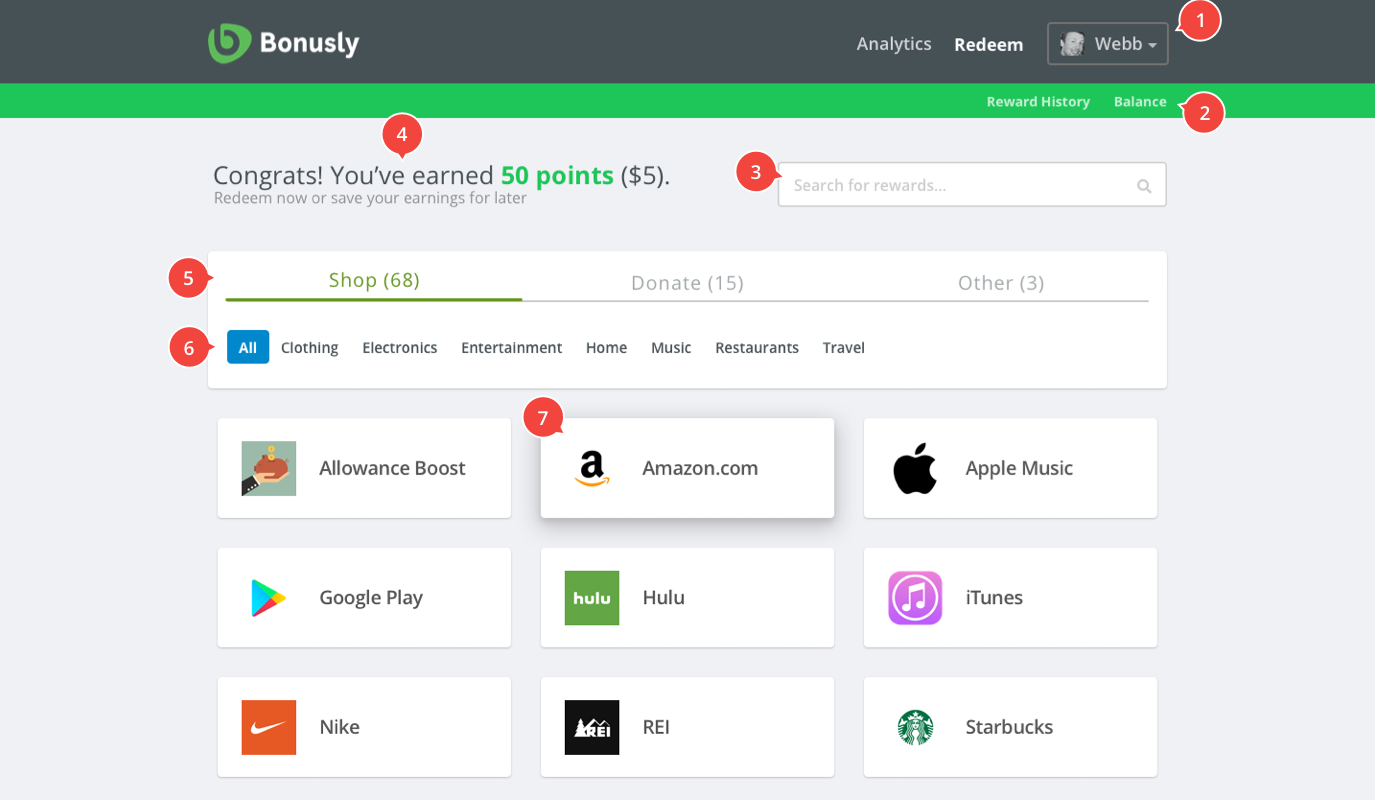
Some changes worth calling out:
- Modified header nav w/ emphasis on Redeem (currently active), also a minor border adjustment to the ‘Profile’ dropdown to isolate it from other nav elements
- Modified sub-header (less vertical space, added “history” to clarify prior redemptions)
- Added real-time search filter (semi-functional - click the search bar to see results when typing ‘Am’)
- Added emphasis and explanation of “My Points” into the body area
- Main buckets for Shop/Donate/Other Rewards (functional)
- Added Categories for Shop view (not functional)
- Simplified & reduced size of cards for more space and added hover-element for desktop (semi-functional for Amazon.com card)
What about mobile?
Many of the issues raised during the research phase point to mobile fixes, so we’ve applied some of our hypothesized solutions into the following mockup (although in reality, we would test this just as heavily with a functional prototype – I’d love to understand the underlying metrics behind mobile vs. desktop use as well):
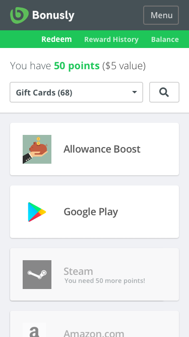
Some changes worth calling out above:
- Header: we took this opportunity to update the hamburger menu to Menu (and A/B test it)
- Sub-header: We kept the slimmer sub-header with a different ‘active’ treatment for Redeem
- Categories & Search: We’ve consolidated this into one line. We have some concerns about this..but think that users will likely prefer to select a category to narrow their options below.
- The slimmer cards make it easier to scroll…but the lists are still long without a search or category filter.
Questions & Concerns on the Proposed Designs
- Style Guide: I didn’t see much use of drop-shadows anywhere else on the site. The hover effect above might contradict that…and I could quickly provide a more subtle treatment if needed. The Shop/Donate/Other tab treatment is also a new convention for the site.
- Layout: The page has more elements than it did before…so it may be considered too busy to our users. This is definitely something we want to look for during testing.
- Tone: I added some exclamation points and ‘Congrats!’ text that may or may not fit the writing style that we want the brand to communicate. I’d likely work with Marketing (and others) to ensure this aligns with the rest of the brand.
- Navigation: From what I’ve seen, the main header nav and sub-header nav can change completely depending on the user context (particularly for Admins) – it’s possible that I overlooked some conventions here that have historical context…but overall, I think the site navigation has room for improvement.
- Card CTA: I removed the large green button for the desktop prototype and the mobile screenshot above. I’m unsure if this would be helpful or confusing for users…but we could quickly identify that during testing.
- Card Size: I’m also unsure if the ‘logo’ sizes needs to remain large. Ideally, this would’ve become clear during research discussions with the team and existing users.
- Mobile: I have some concerns about the ‘search’ button here. I’m curious if users would find it more helpful than the ‘filter’ dropdown. It’s possible that this design could change to accommodate the preferred user action (instead of both).
- Add Card placeholder: At the bottom of each Rewards list is an ‘add another’ card placeholder – in this case, they’re meant for Admins (as a quick link to the Catalog)…but we could also explore an action for regular users, such as a “Suggest another _______”.
3. Test & Improve
It’s time to observe users with our prototype (ideally existing customers & prospects that match closely with our target personas). The more information we can gather, the better – but we’ll likely start to see diminishing returns after testing 5-10 users.
How do we do that?
Existing customers: Ideally, we’ve got a pool of customers we can contact for feedback (and if not, we should recruit some). Aside from internal folks, this is our best resource for understanding the impact of change in the product. They’ve usually got strong opinions, contextual knowledge, and a way of doing things already. We need to observe their emotions, frustrations, delights, and share that with the team.
Prospective customers: Is this feature blocking a sale? Take this opportunity to get feedback from that customer. Let them know we are working on it and want to understand how it matches their expectations. We need to be careful though – we don’t want to cater to a single customer for feature requests…we want our product to fit the needs of our target market as a whole (maximizing users and MRR vs. one super happy customer). Still, if this is a common request for prospective customers…then we’ll want to gather lots of feedback from them.
Third-party tools: there are a lot of options out there – the main benefit is that we can get feedback very quickly. I’ve had a lot of success with UserTesting.com (huge user pool, very fast responses, ability to screen testers for certain criteria) and mixed results with TryMyUI (slower, more generalized user base). Again, there’s a lot of benefit with sharing quotes and usability videos with the team. Sometimes there are some wild surprises.
Hallway tests: internal tests with stakeholders, colleagues who are largely uninvolved in the effort, etc. Typically this would’ve been done prior to building out a robust prototype…but can still be helpful in certain situations.
Friends, family, colleagues: when the going gets tough…you can get helpful feedback from just about anyone – but will likely need to take it with a grain of salt and ensure you’re prompting in a way that produces honest answers.
What are we trying to learn?
We’ll want to craft this test around our main learning goals (outlined in the 3 hypotheses above).
- Does the design effective-ly solve those problems?
- Is it easy to use? Can it be improved in any way?
- Does it elicit a positive emotional response? Does it resolve formerly negative ones? Can it be improved in any way?
Throughout our tests, we need to carefully listen and pay attention to their responses, as well as any additional recommendations, insights, or pain points they communicate.
Now what?
There are a lot of directions our tests can take us next, such as…
- Turns out we’re chasing the wrong problem → abandon this feature and/or revisit the problem space (although this should be known through customer interviews and micro-testing before spending this much time on it)
- The design doesn’t effectively solve the problem → understand why, discuss with the team, restart the Build process (again, our research should help mitigate any risks behind this…and it shouldn’t happen that often, if ever)
- The design could be easier to use → refine the prototype with our new knowledge and re-test as quickly as possible
- The design could be more delightful → same as above
- Users identified another potential solution that we should also explore → jump back to the Build phase with your new insights and test as quickly as possible
- It’s ready to release into the product → move on to the next step
4. Launch, Monitor, & Repeat
Launch
Since product design is a collaborative process, (it’s my responsibility to ensure) the engineering team is already up-to-speed on this feature. I’ve shared learning, instilled trust and support in the design direction, and know exactly what the team needs to push this feature into production:
- Flat mockups
- Sketch files (and relevant art assets)
- Living style-guide elements
- Functional prototypes
- Ultra-high-fidelity prototypes to showcase layout, interactions, movement, etc (e.g. Framer, HTML/CSS/JS)
In this case, I’ll likely need to provide a mix of the above (for edge cases, interactions, timing, spacing, movement, etc). The engineering team will likely play a large part in the design from start-to-finish as well — in my experience, engineering teams can provide some of the best recommendations throughout solution brainstorming…so again, this process helps ensure that they’re up-to-speed way before they start working on it.
Monitor
It’s critical that we have some benchmark metrics in place before pushing this to production (Google Analytics, HotJar, and MixPanel are all great – and we can also benchmark qualitative feedback as needed):
- Number of Support requests attributed to the Rewards page
- Avg. time spent finding and redeeming rewards (mobile + desktop)
- Common requests and feedback from account management pre/post launch
- Retention rate (may take some time to see)
- Referral rate (may take some time to see)
If we have any hesitations or concerns about the new Rewards page – we could also roll it out incrementally with multivariate (A/B) testing. If we sent 10-20% of users to the new page for the first week, then we will likely learn a lot from their behavior and feedback before pushing the changes to 100% of users.
Repeat
We’ll learn a lot about this feature as soon as it’s live – it’s important that we have resources to quickly refine those features and optimize them for our users as quickly as possible.
Everything we’ve done to this point is meant to limit as much guesswork as possible…but we won’t really know how successful we are until paying customers are using it. We have to continually monitor user behavior and feedback for any new features – and we also need to understand when/how to help users react to product changes (through email announcements, release notes, onboarding, etc).
Questions?
I’d love to hear your thoughts on this project. Please contact me if you have any additional ideas or questions ![]()