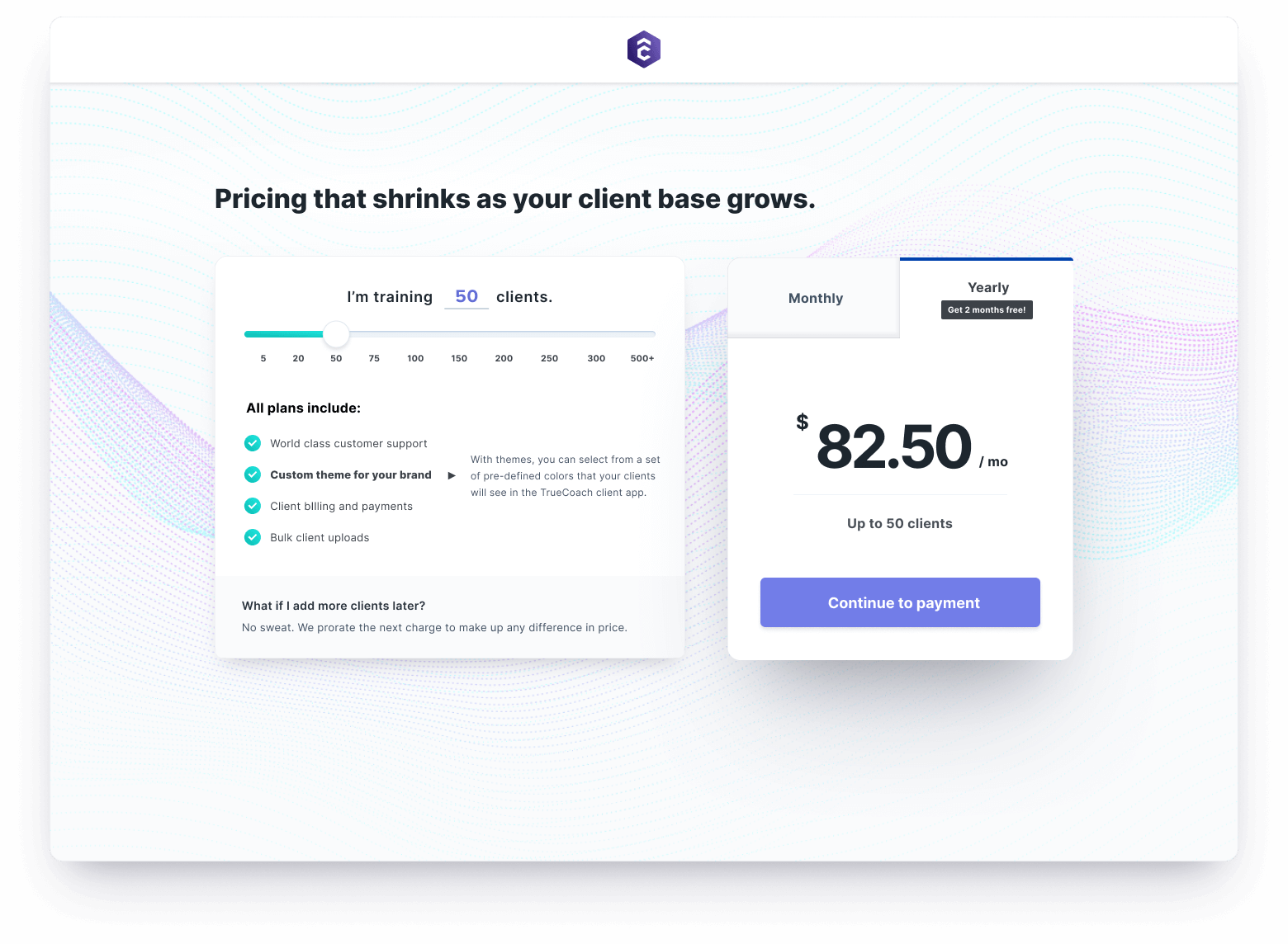
Problem – Customers were unable to upgrade their payment plan beyond a set of entry-level options. This caused frustration, slowed revenue growth, and added unnecessary support costs.
Solution – Through internal/external research and testing, we designed a series of simple, helpful, and flexible improvements to the activate and manage account experience.
Outcome – We reduced 99% of related support costs and saw a slight improvement in average revenue per user and conversion (~1%).
My Role
I led the design of the “activate and upgrade” experience between October 2019 and April 2020. I collaborated with another talented designer for routine feedback, mobile considerations, and visual design improvements.
Early in the project, we partnered with representatives from marketing, customer success, and engineering (front and back end) to fully understand the problem and discover potential solutions together.
We tested and validated our hypotheses on actual customers with prototypes and usability testing sessions. During this time we uncovered additional account management problems that weren’t as visible to our internal team.
As we moved into development, I worked alongside the engineering team to define and incrementally ship solutions to our customers. We also established benchmark metrics to measure the effectiveness of each feature.
Discovery
TrueCoach’s pricing model is based on the number of clients within an organization. Originally, we provided these options within the product and marketing site:
- 1 to 5 clients: $
- 6 to 25 clients: $$
- 26 to 50 clients: $$$
- More than 50 clients: Contact us -> The familiar SaaS pricing model that you see pretty much everywhere.
We learned from our Customer Success team that we actually offered ~15 additional pricing tiers beyond these three (for up to 1000+ clients). Typically, we only unveiled these plans whenever customers and prospects asked about them. Why not make the majority of these plans available to existing and potential customers?
Deeper Insights
While conducting interviews and usability tests with customers, we also uncovered a number of problems within the user journey:
🤔 Frustration around monthly vs yearly pricing (also a common operating cost).
😕 Difficulty converting from a free trial.
😕 Difficulty understanding our pricing options.
😕 Difficulty changing a pricing plan.
😕 Difficulty canceling an account.
🤷♀️ Lack of data to understand why certain customers left.
With this additional research and understanding, we were able to reframe the problem in ways that benefited both the business and our customers.
Ideation
Armed with these insights, we held a design studio with our cross-functional representatives (some tuned in remotely). Many sticky-notes later, a few common themes emerged:
- Introduce UI patterns that enable users to review a larger set of pricing plans -> sliders, dropdowns, and input fields all started as our initial candidates.
- During free trials, persist the “Activate now” call-to-action in the
nav-> always visible and provides sense of urgency with countdown. - Add “what you’ll pay today” language on “review and confirm” page -> avoid accidental charges and frustration.
- Add invoice history section -> improve transparency.
- Collect zip code information to billing section -> avoid complications surrounding disputes.
- Upon activation, provide celebratory confirmation with access to additional onboarding materials (newsletters, webinars, help center, etc) -> set customers up for success.
- Ask for optional
reasonwhen canceling an account -> learn what drives churn.
Putting it together
Wireframes
Next, we wanted to visualize some of the competing solutions introduced during our design studio. Our learning goal was to determine which concepts seemed like the best bet within the context of our coaches day-to-day flows (rather than hypotheticals discussed in front of a whiteboard).
After presenting each low-fidelity concept, we debated the pros and cons amongst our team and ultimately voted on the most compelling solutions. Each member of the team was asked to vocalize their reasoning behind their votes.

"Pro plan variation" wireframe concept (abandoned, not clear enough).

"Slider" wireframe concept (successfully advanced to prototyping and testing).
Moving to high fidelity and prototyping
From here we were able to refine our user flows and move directly into high fidelity prototypes to de-risk any lingering unknowns with actual customers.

What we ultimately delivered to customers.
Shipping
Working with our agile project manager and engineering teams, we split our design concepts into a series of epics to prioritize and deliver to customers, which looked something like this.
- Persistent “activate now” call-to-action + countdown in nav bar.
- Replace three-tiered pricing page with new slider design.
- Add optional
reasondialog to cancelation flow. - Add “You will be charged $[amount] today” section to confirmation view.
- Add billing details view (collect zip codes).
- Add invoice history view.
As of mid-2020, we successfully released the first three solutions to customers. The remaining projects remain relevant but are growing a bit stale in the backlog. If they are re-prioritized in development then we will likely spend some time rebuilding context and updating our designs to align with any relevant product changes.
Impact & lessons learned
- Trimmed related conversations in Intercom by nearly 100%.
- Saw a slight increase in average revenue per user and conversation rates (although this might be attributable to external factors related to the pandemic).
- Sharing the problem and solution as a team helped us generate better ideas, increase momentum for the work, and keep the rest of the company informed about the project along the way.
- Prioritizing and shipping the project incrementally helped us deliver the right solutions faster.
- Some product decisions changed throughout the project and weren’t documented well. This led to some confusion and wasted revisions while iterating through the wireframe and prototyping phase.

